Backworlds update
I have been neglecting this space for a while – nothing about GDC, E3, SGDQ, SDCC or any of the games I have played this year – while it was always intended to be a casual affair, I do dislike it when blogs unceremoniously stop getting new posts. There are a few reasons for why this happened, but the most important one is that I have been working to complete and polish Backworlds. Today, we announced that we’ll be a part of the Indie Megabooth at PAX West, as well as demo at GamesCom and EGX. We also unveiled this fancy new trailer:
I tend not to talk about Backworlds on my own channels since it has a social media presence by itself, but I would guess the two will blend a bit for the upcoming months. It has been almost 9 years since we started experimenting with this concept and we have lost and found our way more than once, more on that in a later post but for now I’m happy to say that we’re close to the finish line. We are pretty proud of the game we have made, so check it out =)
Backworlds
So, the game Juha and I made for Assemblee a couple of years back felt like a good idea – we both wanted to continue working on it to really explore the depth we could bring it to. We have been working on it since, but until recently the work was mostly exploratory. We did not have any clear goals in mind, at most a vague direction.
We have now reached a point where we have a good idea of what we want to do and how we want to achieve it – to that end, we launched the backworlds.com website and the indiegogo campaign to fund development. I am guessing if it all goes well I will have more opportunity to discuss what has happened during the last two years and – more importantly – what the game is about and how it comes to be.
I can reveal one thing though – we changed the name to Backworlds. The ‘s’ is new.
Redecorating

… So I decorated the walls of my apartment this weekend. To be honest, this has little to do with anything else that has been posted on this blog but as this is as good a place to document the process as any I will do it here.
Preparation
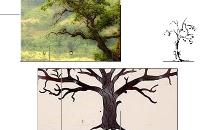
When starting out, I only really knew that I wanted to do tree silhouettes so I drafted up a quick blueprint of my walls in Inkscape and then made a mockup with some images of oaks I found and liked. I honestly cannot remember where the specific images came from apart from the small one which was part of the art collection by HammedHareet that we used for Backworld, but that matters little. I had been really sloppy in the exact locations of electrical outlets and lightswitches in the blueprint, something that came back to bite me later – but I am getting ahead of myself.
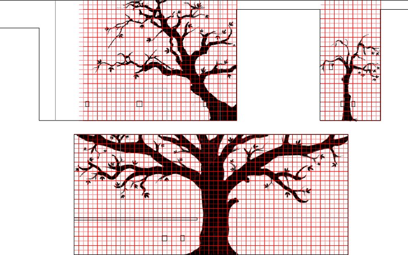
At this point I had cleaned up the images and made them into silhouettes. As the images had different origins I tried to make them somewhat similar – this meant adding branches to the stylized trunk and removing them from the photograph. In retrospect I should have spent a lot more time on this as some of the branches have really uneven thickness, but that is something to remember for next time.
I added the grid in order to break down the process of scaling up the image into manageable parts – it is a lot easier to replicate and enlarge one square at a time than an entire image. You are also almost guaranteed the image will not be distorted. Someone suggested I should project the image on the wall and then pencil the shapes – this would probably have been a really good idea if I had been painting, but either way I did not have the equipment for it.
Day one
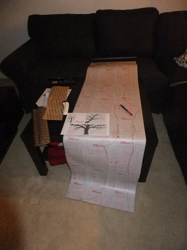
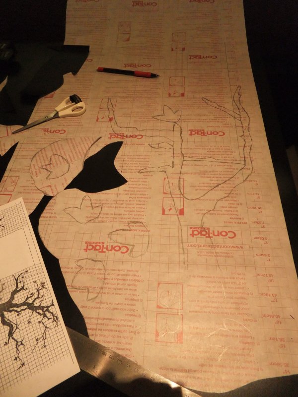
It was suggested that I use contact paper instead of painting, I did some tests with scrap pieces and it worked out really well. The only downside was the poor availability of colors but since I was only going to use black anyway it mattered little. The image shows the first piece – it can be hard to see but I pencilled the grid on it to do the upscaling.
The back of the contact paper actually already had a grid, but it was in half-inch increments and my measurements where in centimeters. Had I thought about this before I could probably have saved myself some time measuring the grid, although I would probably still have had to draw it.
Finally, the keen eye will notice that the print of the pattern is actually mirrored since I was drawing on the back of the paper – not an absolute necessity, but I find minimizing the possibility of mistakes speeds up work. I had mirrored and normal printouts both with and without grid for reference as the grid sometimes obscured details in the image.
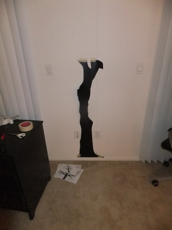
Just before attaching the first piece to the wall. It is a bit faint in the picture, but I improvised a plumb by attaching a screwdriver to a piece of thread and then taping it to the ceiling. I then taped the corners of the trunk to the wall in order to make sure it lined up properly before attaching it – it turns out I was needlessly cautious as the contact paper was really easy to attach. It doesn’t crease so as long as you get one small piece attached correctly the rest will not be a problem, and should you fail it can easily be detached and placed again.
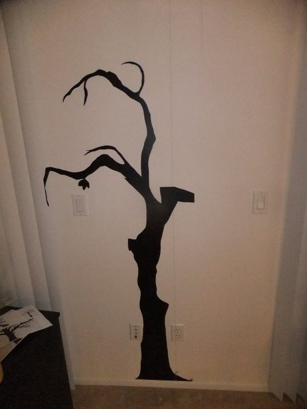
First branches attached. Discounting the leaf this is now three separate pieces, but in normal lighting conditions you really cannot tell unless you walk up and search for the seam.
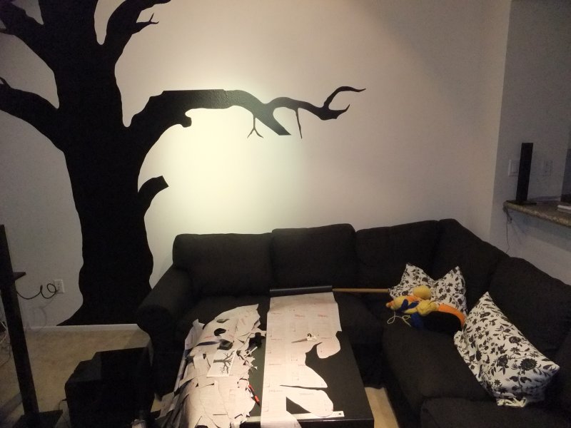
Another picture of the workspace. The branches (as well as everything on the other walls) were drawn out with the contact paper lying horizontally whereas the trunk was a vertical piece. This made a lot of sense from an economical standpoint as there was little waste even with big pieces, but as it turns out the difference in light reflection gets really obvious when you join two pieces rotated 90° to each other. For this particular tree it was okay since it does not get hit by direct sunlight but later on I made sure only to rotate the pieces 180° on the roll.
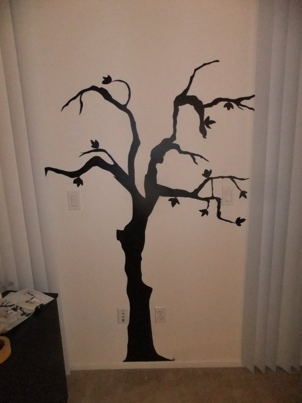
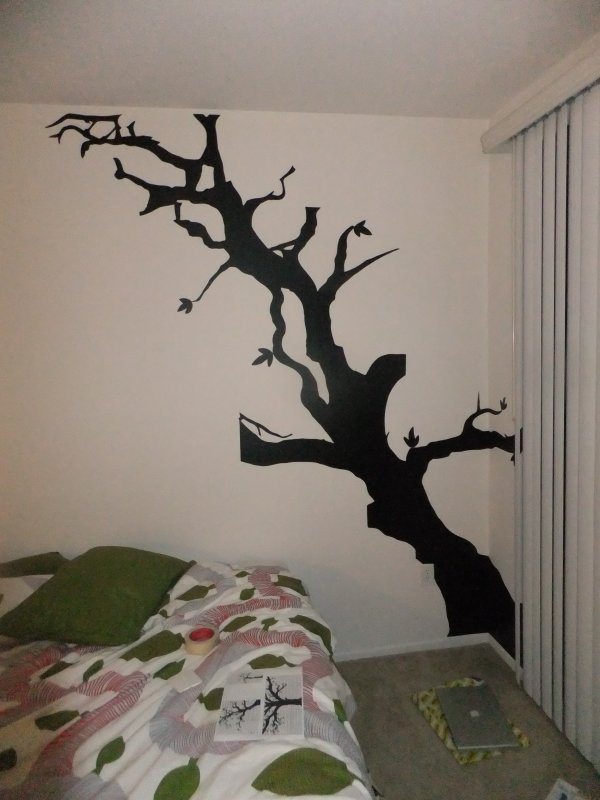
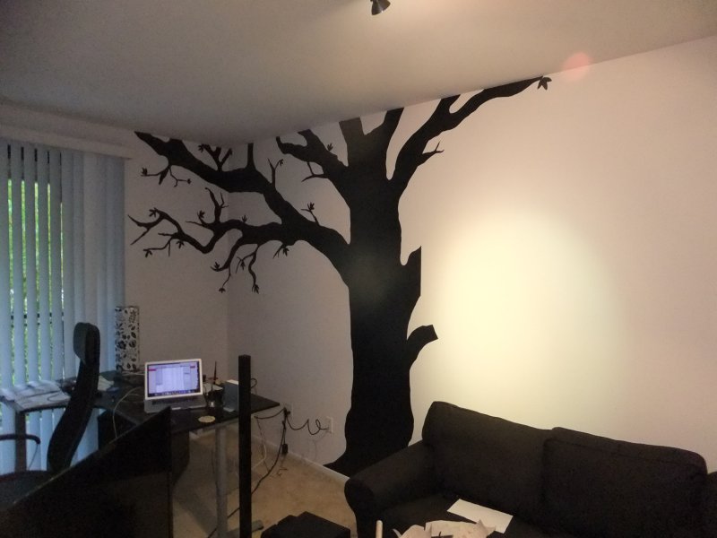
All done with the first wall. I had to cut off and modify the right branch since I had been sloppy with placing the lightswitches on my blueprints, but other than that it was easy. Getting the first tree up took around four hours, but I was overly cautious so it took longer than it had to.
Day two
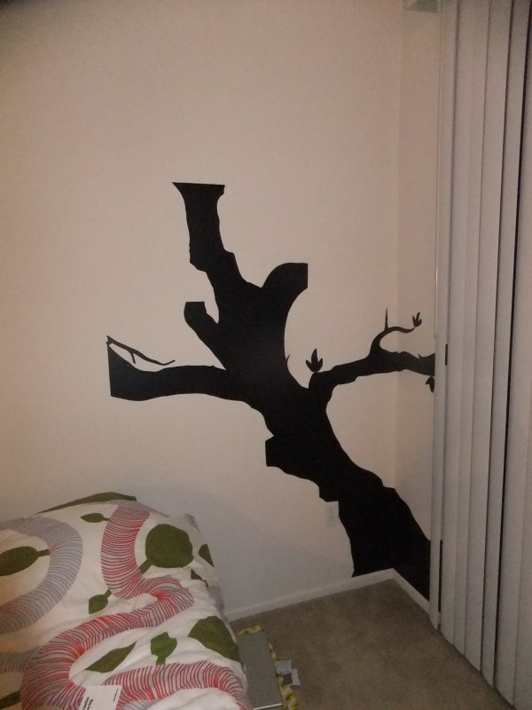
At this time, the trunk consists of four pieces stacked on top of each other. The second-highest piece, the one with the branches, was one of the longest I did for the entire project, but thankfully attaching big pieces of contact paper to the wall was no problem at all. Corners turned out to be a bit of a problem though, and I probably should have cut up the base piece in two and put one piece on each wall – making sure it was aligned with both the doorway and the ceiling while crossing the corner was cumbersome and even now it is slightly angled. Luckily, the tree itself is by no means straight so it does not show.
Second piece of the trunk done, discounting leaves it is 8 different pieces. Compared to the earlier tree this looks kind of jagged and abstract which is ironic considering it is the only piece based on a real tree, but then again I could probably have done a better job cleaning up the picture when I was at that stage. I had spent at least five hours on it at this point and it was well past midnight so the rest would have to wait.
Day three
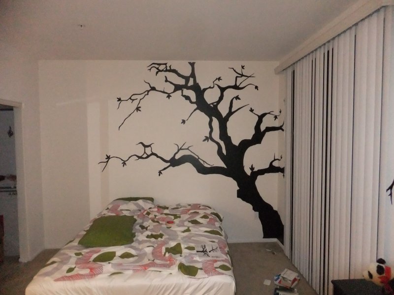
Done with the second wall. The only difference is that I attached four branches, two on each side and five pieces in total. And some leaves. These pieces are kind of big – around one meter each in length – and while this produces a lot of waste contact paper it is a lot easier to attach it and get it to look good since it more or less takes care of itself once you have positioned it. In other words, less pieces = less attachpoints = less potential issues. Finishing up this wall took between three and four hours.
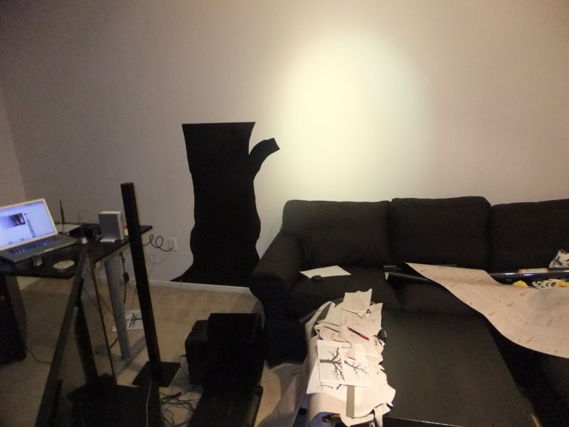
Onto the final wall, again I am placing the contact paper horizontally and building the trunk up in pieces. It is actually too wide to be made in one strip anyway. The first three pieces are relatively simple – in retrospect I probably should not have bothered drawing out the entire grids on the paper – and I am done in less than two hours. To be on the safe side I am using a plumb again but I really did not need it.
Day four
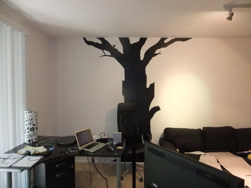
With the help of a chair, I managed to put up the last pieces of the trunk. This is now seven pieces – as many as the last tree in height, only that one had a couple of branches in separate pieces while this only has the one.
Left branch. Due to the complexity of this branch and the complexity involved in splitting it into pieces, I have now spent more than seven hours of the day. During the course of the project I have occasionally decided to change the design slightly when branches where just a bit too long to fit inside the bounds of the contact paper, but doing it too much would make the tree look ugly. An alternative would have been to think about how the pieces would be cut out when I drew the design, but I chose to work with less limitations out of personal preference.
At this point I have finished the first roll of contact paper – 18 inch by 75 feet, meaning I have drawn around 900 squares.
An image of the first piece of the right branch, and the mess on the workspace that has now begun to overflow down to the floor.
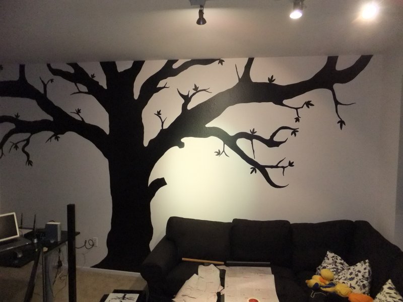
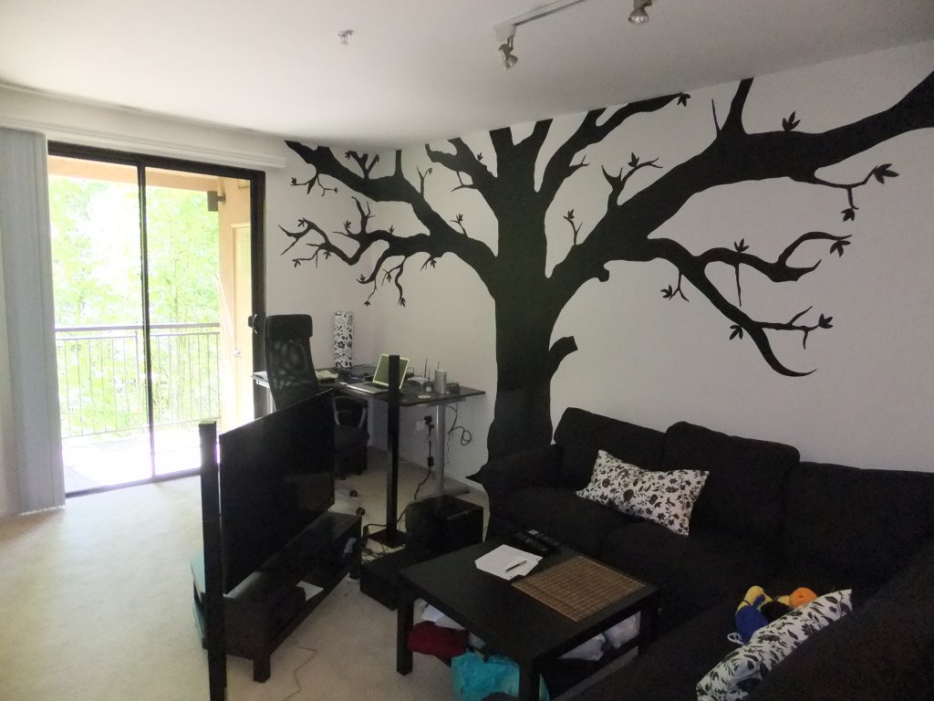
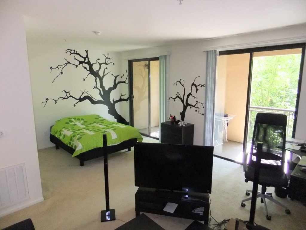
Finally done. I spent somewhere between 9 and 11 hours on this during the day, meaning around 12 hours on the tree as a whole and maybe 4 workdays on the entire project – but it was all worth it as my home is a lot less bleak now. Most of the images were taken at night with artificial lighting, but here are a couple of images of the finished pieces taken in sunlight;
Putting giant stickers on the wall is nothing new, of course, there are a few companies that specialize in just that. I personally have a Blik in my bathroom that I really like, and considering that most of my time with this went into drawing and cutting out patterns getting pre-existing decals instead would have been a lot faster. There is something to be said for decorating your own home though, and if nothing else this was probably the cheapest way to go about doing it.
SoManyRooms
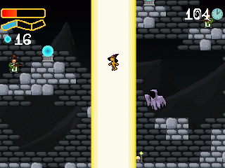
The Room Jam was held this weekend, a gamejam where the participants each created a flash game taking place in a room – the collection of rooms have now been merged into the game SoManyRooms. The Global Game Jam also was this weekend, so it seemed like a good idea to join the GGJ:ers in spirit rather than join in the actual event.
The room I made with music by my coworker Johan Althoff is a short arena shooter of sorts, my intention was to create a game where the player’s powers are more aggressive and powerful as his health decreases, thus having a central risk/reward mechanic. To some degree I think it worked and the concept could be taken further by experimenting with reach, spread, power, cooldown and other attributes of the different attacks, but I am not sure it is interesting enough to warrant more depth.
Yarn
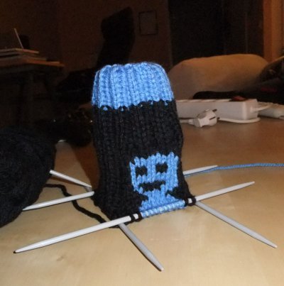
Those who have known me for a long while know I like handicrafts and used to do it quite a lot when I was younger… Like any pretentious developer I like to be creative, and I like to keep my hands busy. It is not that I prefer knitting to other crafts, but it can be done without paying too much attention to it which is great when enjoying non-interactive entertainment such as watching movies – hence I occasionally knit stuff. Long story short, I decided to get rid of it a few months ago and started selling for the Child’s Play Charity in the beginning of November through this page.
All in all, the auctions gathered somewhere around $600, thanks in no small part to Terry Cavanagh who helped out by offering a bonus to those interested in the VVVVVV socks… I am not sure what to do next, but for those interested there is this thread on TIGSource.
… That is all. This was an extremely egocentric post, but it was fun to something out of the ordinary for Child’s Play instead of just buying something from amazon.
Smoke
A long while back I started planning a rather unoriginal metroidvania game, in part because I had nothing else to do with my spare time and in part since I have always liked the genre and wanted to try doing something with it. After considering what I really had to add to the genre I put it on hold until Lyle in Cube Sector inspired me to approach it in a new way that was still very traditional; instead of moving blocks around, though, my game would revolve around using steam and gas with different properties. I had to postpone this project, but kept working on it every now and then until I just recently finished something of a playable demo.
I give you Smoke:
It is a very short demo considering the time it has been in production, less than an hour for the experienced action/exploration gamer, but hopefully it has some value.
Download OSX (Snow Leopard) version
I did everything but the sound myself, so it does not compare very well to other games in terms of visuals – on the bright side, I like to think I have learned something about painting during the time spent working with this project. Other than that, working on this game simultaneously with other projects using the FT engine has given me a lot of insight into code pragmatism; the clearer the target you have in the beginning of a project, the easier it is to write clean code quickly. No surprise there, but what did surprise me was how much easier the code written with a single purpose was to maintain – even though it was never written to be extended in the first place.
Working on Smoke takes a lot of time due to the complexity and traces of the initial lack of direction still found in the codebase, but also because the graphics took a lot more work than my earlier solo projects. Feedback on this demo and my own employment situation will determine where I take it from here, but if there is one thing I have learned it is that I need to get more people involved if this is to go much further.
A Jam and a Rant
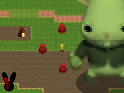
Another iteration of Gotland Game Jam, this time I worked with artists Zenobia Homan and Jona Marklund to create the game Masquerade [download win32]
The theme of the jam was “the Play” and Masquerade is a top-down brawler where the participants are actors on a stage using costumes lying around to act out the roles of different kinds of warriors. In all honesty, this is design-wise not very different from simply picking up new weapons, but as we all wanted to make something complete innovation took a backseat to playability. It was a while since I last made a top-down brawler but what was really new for me was the basic AI of enemies with quickly changing abilities, luckily I did not need to worry about art so I had plenty of time to get it to a functional level. The end result is nothing spectacular, but a decent diversion if I may say so myself.
Some friends and acquaintances I have in the indie scene have told me that they usually do not go to these kinds of events to create games anymore, rather they just try to have a good time and meet people. I am starting to see why – not that I do not like making short games under pressure, but the tradeoffs you make are starting to become apparent. First of all, making a game in 40 hours can be a very demanding experience that you really have to prepare for and plan around, and fun as it is there are more enjoyable and productive things to spend your time on once you have done it a few times.
But also, there is some limit to what you can accomplish. I know a lot of people are championing rapid prototyping and I do not argue that it is a good way to create good games, I just do not think it is the only way. You can create great core mechanics in a short time, but for some ideas the greatness lies in the scope. The thing separating a great game from a poor one might be production values or long iteration times as well as a great core mechanic, and I think that by being short-sighted you can loose a lot of great ideas. Alec Holowka touched upon this awhile ago. I do not really buy into the whole “If a game idea is not fun after the first two hours of prototyping it needs to be scrapped” – mindset, it reminds me of the larger games industry, the impatient industry where books are written about the concept of the “elevator”-pitch.
In short, I think the amount of time we spend on being quick is staggering and it thus misses the point. Whether we are pitching a game to a publisher or trying to sell our own image as developers to the indie crowd I think the entire game development world could benefit from more wanting to create good games and less wanting everybody to know about them immediately.
… But then again, I guess there are a lot of people who are developing good games anonymously – we just do not see them.
Blast from the Past

Logan Westbrook wrote some nice things about the Darkness on the Escapist, it’s been almost three years since it was released so it is nice to see other people still thinking about it. I personally liked the game but the story parts got kind of ruined for me since the important scenes in question were horribly broken the first time I saw them, but we worked a lot on the game over a long period of time so I am somewhat relieved to hear the hard work paid off.
Also, the results for Assemblee have been revealed! Congratulations Ivan! Our own project Backworld ended up sharing a 6th place (with Tiny Crawl, one of my personal favorites), which is not half bad considering there were 73 entries in the competition.
Global Game Jam
The Global Game Jam was this weekend, and after failing to set up a local event me and a few friends decided to go to the Nordic Game Jam, reportedly the largest GGJ site. Besides hanging out with friends, acquaintances from the indie scene and making a few new connections, we (Juha, Martin, Tobias and I) created a short game called “Fake“.
We were in development up until the final minutes so there is no proper tutorial; consider this an introduction. Your role is that of an art forger working for the mysterious mafioso “Don Key”. Funds being sparse, you are limited to cut and paste existing images in order to reproduce the paintings.
Start out by selecting a painting, then selecting a theme for your photos on the right. You can re-select the theme later by clicking the button on the top-right but it will reset your work. Click any of the images on the right to select a source, then use the left mouse button to cut out a pattern and use it on the forgery. The left menu bar can be used to select or move the active layer, you can also use the right mouse button to delete a layer. When not cutting a picture, you can move the active layer with the left mouse button, rotate it with the right or press both mouse buttons to scale it. The button on the top left will swap the preview mode of the real painting, how it is shown will have no bearing on the final result, though. When you are done, press the button second from the right at the top to submit the painting for approval by Don Key.
I was really out of my element when hacking this together and too much time went into hacking GUI elements that a proper tool would’ve provided for me. This being the case, the final version does not only miss a proper tutorial but also some basic UI elements and it comes with a lot of bugs. That being said, the game was fairly fun for what it was, the idea feels solid and we managed to make a game out of the development itself by taking pictures of jam attendees and using them in the final version – always fun to do at events like this. All in all, we had a great time at least.
Sadly, we had to leave halfway through the finals and I have not seen very many of the other games from NGJ yet. I would like to give a shout out to Shoot Stop Lollipop and Shadow Ninja… Monkey though, as they both had genuinely interesting gameplay mechanics.
Backworld
The deadline for the second part of Assemblee has passed, me and a buddy from work submitted a game we call Backworld. Early reactions have been positive, but as always the competition is stiff – I have yet to play any of the other games but I am looking forward to doing it sometime in the next few days.
Backworld is a puzzle-platformer featuring a rabbit, with the twist that the world always consists of two layers. Each layer has a separate set of physics and the player can use the mouse to paint on the screen to decide what layer should be used at what position in order to progress. I do not really have the patience for things like animation so the competition rules – that we were only allowed to use content from part one – did not really bother me personally at all. The timeframe more so, it felt like even though the original idea was interesting and fun to work with a few months more of experimentation, polish and weeding out the levels that just didn’t work would have made a huge difference. Of course it is always hard to produce something in a limited time, when you encounter something that works okay but not as well as you’d hoped you have to make the tough decision of either throwing it away and risk having a game without content or polishing it up and risk having a game of varying or all-out mediochre quality. In Backworld we mostly opted for the “keep and polish” solution in order to see how people reacted to different kinds of challenges, time will tell if this was a good idea.
And who knows, we might even keep working on it and make something better.
